Hi, I'm Kayla!
OR "bartcn"
I'm a 2D artist specializing in graphic design, motion design, and poster art.
Graphic Design
"EL CHICO DE ARGETINA" — Concept CD Art


Motion Design
"Call Him Father" —Animated Logo Bumper

CASE STUDIES

"Call Him Father"
Created a logo package for the podcast "Call Him Father." Including a primary and submark logo, and animated bumpers.Read more
The Harvest
Led in creative direction, content creation, and some social media management duties for "The Harvest" (New Song Church, Bellingham) Instagram page.Read more
Bellevue College Infographic
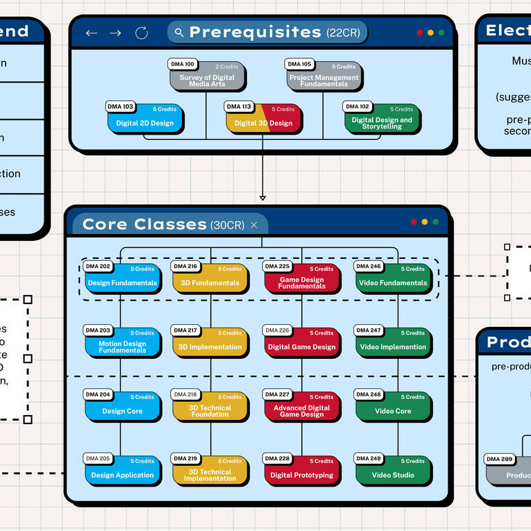
Led in creative direction in a team of fellow student-designers tasked to create a "Course Pathways" infographic for Bellevue College's Digital Media Arts program.Read more

Long-Term Motion Design Project
For eight years and ongoing, I managed and produced over 80 motion edits and visual concepts for a personal creative brand on Instagram.Read more
'"CALL HIM FATHER"
One Big Step
I was approached by Micah Moeller to create a logo for a podcast he'd be co-hosting with our pastor called 'Call Him Father.' This was my first professional gig as a graphic designer, and it truly felt like a special project to do because these designs would be used by my church and people I was well-acquainted with. I was determined from the start to make a good impression, and create something that fit the vision for "Call Him Father."After many revisions and pondering stylization, I'm very happy with how the final products look. This project has made me much more confident in my abilities as a designer. This is surely the first of many gigs to come!


Completed Deliverable To Client's Standards (3/13/26)


Early Drafts (1/19 - 1/29/26)
Early Stages
As asked in the creative brief I was given, I was to create logos identical to the branding of New Song Church. It was a challenge to work in such limited boundaries, but I did my best to create some drafts based on his requests. He had also asked for some sort of symbolism, including Christian iconography that wasn't too on-the-nose. I experimented a lot with this, and ended up with a couple unique concepts. However, both the client and I felt like we could improve on these designs, and these concepts were scrapped before moving on to a less restricted approach.
The Primary Logo
After going back and forth with New Song-style drafts, my client gave me the words I'm sure all designers like to hear (to some extent): "Do what you think looks good." While still staying familiar to New Song's branding, new ideas began to bloom in my mind.I knew New Song Church had a history with gothic, black-letter type designs, so I went in that direction. As I was sketching some concepts, I knew this was the direction we'd end up going in. The blacklettering was both coherent to New Song's branding while also having subtle Christian symbolism (alongside having "Father" in red like Jesus's dialogue in Biblical text). It made so much sense!We ended up at a bit of a roadblock when choosing which font to use for the letter "F". Micah thought the first concept looked good, except the "F" looked too much like an ''S". I sent him some other fonts, but they just didn't look as good as the first idea.I decided to play around with that "F" that looked like an "S", because I wanted it to work so badly. After messing around with that long tail, I came up with something that read much more clearly as the letter "F". Now we had our finally lettering down, and it was time to work on the submark logo.


Choosing the "F" (2/8/26)


Before and After fixing the "F"


Early Submark Drafts (3/1/26)


Intertwined Initials Concepts (3/2/26)
The Submark
The early drafts were interesting. I had never had to compose something like this before, so it was challenging to figure out how I was supposed to fit the "CHF" together coherently with the fonts we had chosen. That "F" was a problem because of it's long tail and having to go at the end. I had even considered changing the font for the entire logo just so the initials could fit together. I played around with different cases, sizing, and fonts until I finally came up with the idea to intertwine the letters.
Attempting to Intertwine the Letters
After learning how to properly use Illustrator's intertwine feature, I sent my client a couple variations. He liked the concepts, requested a small change on where overlapping was, and he was happy the final design. Another win!
The Bumpers
I was excited to get to this part because of how much I love motion design and animating in After Effects. The only time-consuming part of creating these bumpers were animating the drawn-in effect for the "C" and "F". I created duplicate layers to separate each letter into several parts the drawing effect appear more realistic. This was done alongside making sure the animations overlapped smoothly with precise timing and speed using value graphs. Thankfully, no revisions were needed for these animations, and I was able to quickly deliver the bumpers to the client's request.

Landscape Bumper (3/13/26)
One Last Thing
I included a freebie simple branding sheet in the package so the client had access to font names and colors I had used on the final deliverables.I also included a suggested secondary sans-serif font to use for body text (Urbanist) and a new accent color that I thought would fit well with the red. I considered that Micah at one point had asked to see the logo in blue, and figured that a baby blue would be a nice accent for the main red with the black & white.

Completed Deliverable To Client's Standards (3/13/26)
Logos in Use


'"THE HARVEST"
Harvest Branding Presentation (May 2025)
Branding for The Harvest
"The Harvest" is a young adults centered ministry at New Song Church, located in Bellingham, WA. After about a year of creating posts for the Instagram, our team decided it was time that we needed to create brand guidelines instead of just designing what we felt was fun for the current moment. It was long overdue, but after discussions with the pastor about what styles and colors he liked, I created a branding presentation for The Harvest. With this, we were able to keep our look consistent and make our social media feed more pleasing to look at.
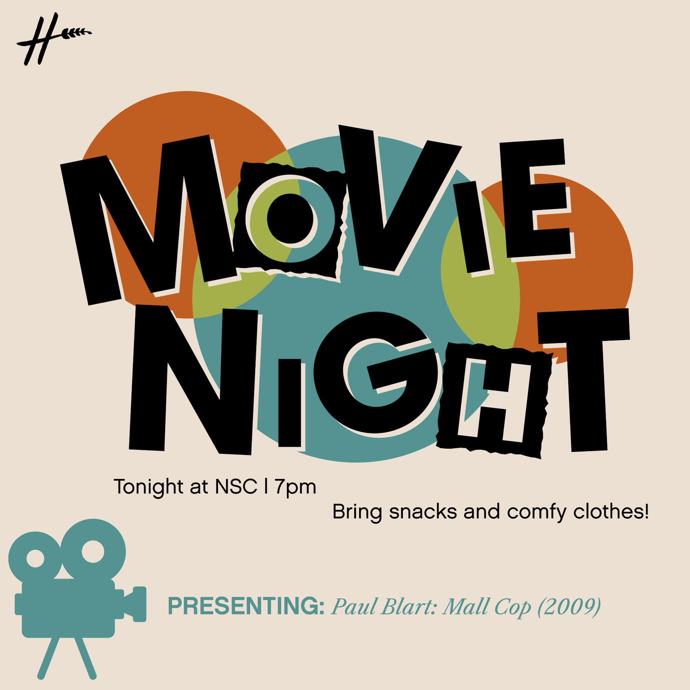
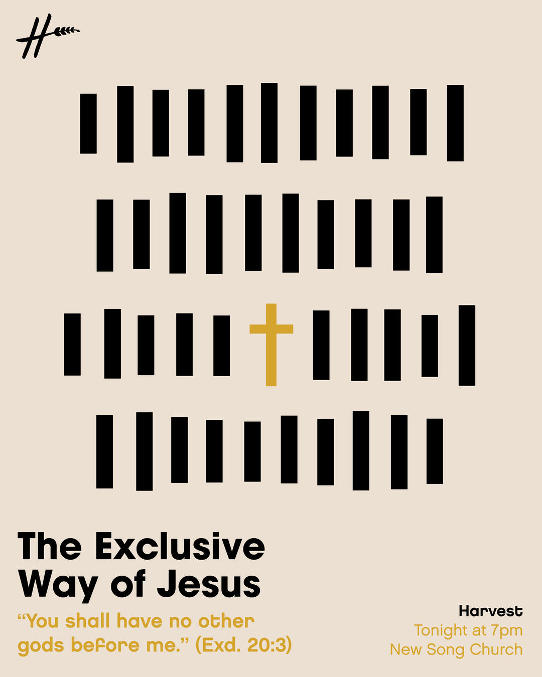
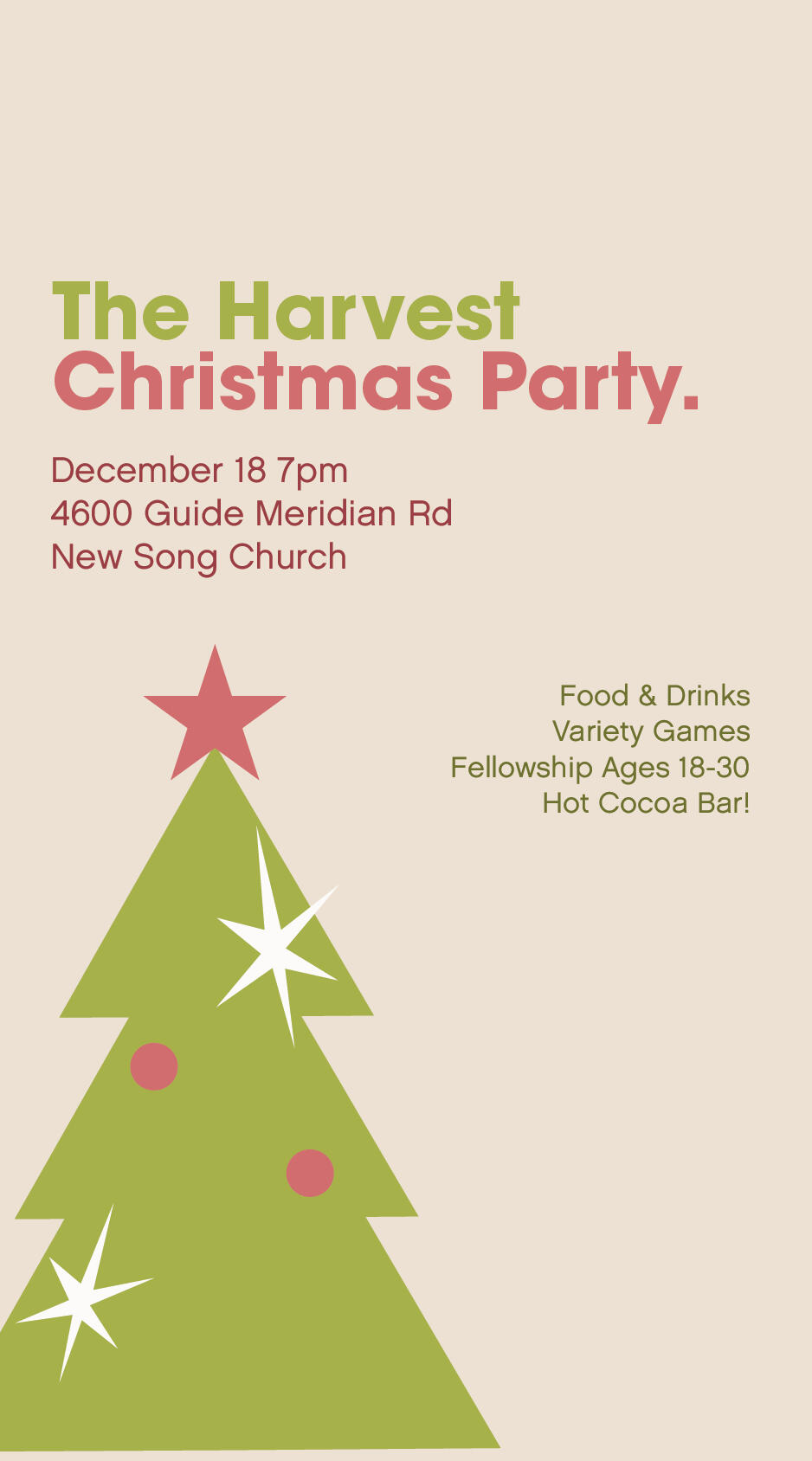
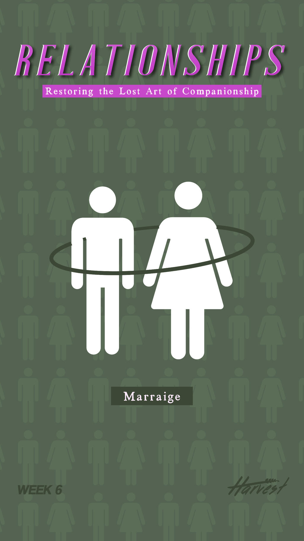
Content Made For The Harvest
Posts
Reels

100% produced, directed, written, and edited by me. This is one of my favorite projects I've done because I got to play as a screenwriter and a director, while having fun with my friends too.

My friend went around "interviewing" people and gave me the raw footage to edit and turn it into something fun. Made with Premiere Pro and After Effects.
Stories
Infographic for Bellevue College
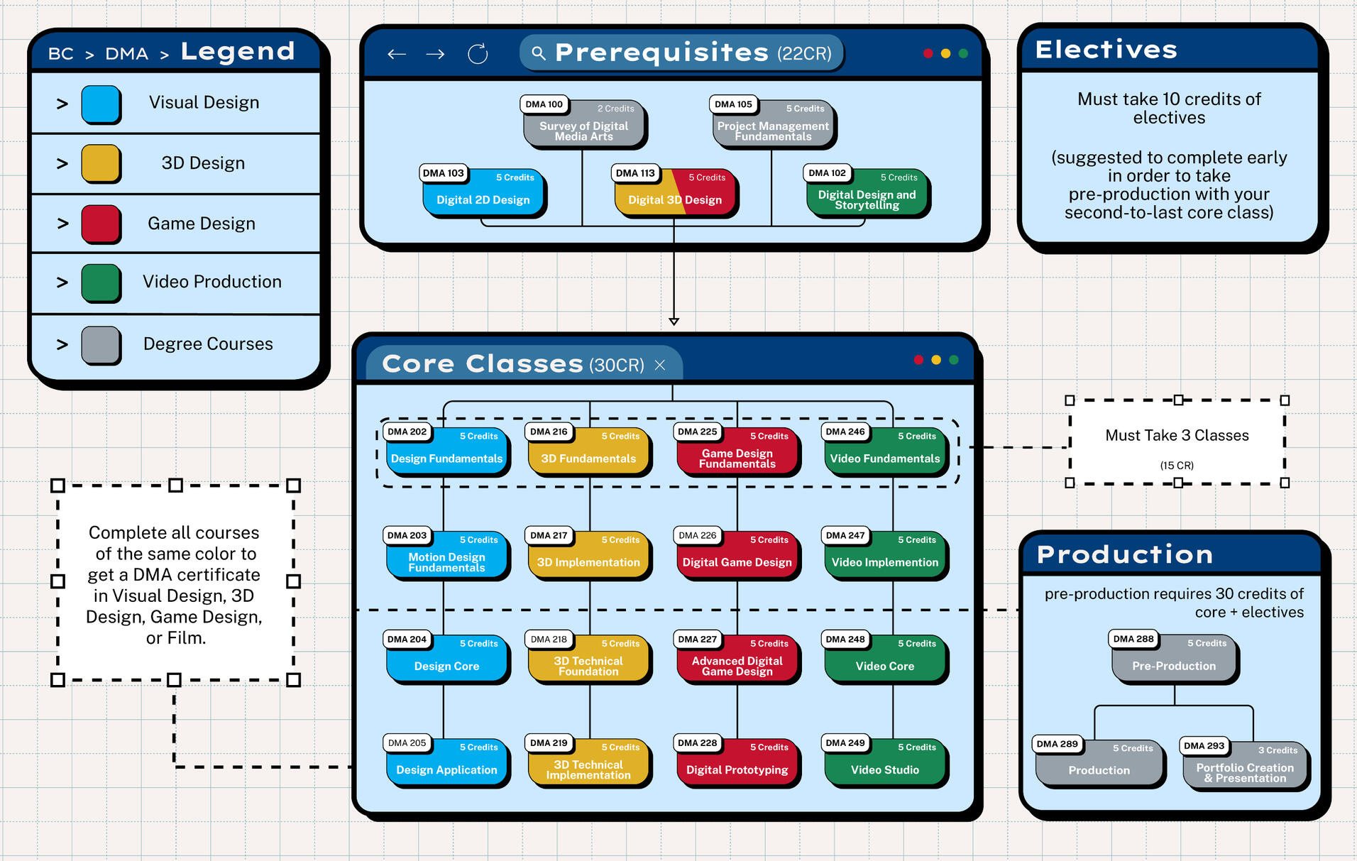
Completed Deliverable To Client's Standards (6/15/25)
Course Pathway Infographic
From winter to spring 2024-2025, I was assigned into a group of fellow design students to create a new course pathway infographic for Bellevue College's website. My role in this group project quickly fell into one of a creative director and project manager. I largely inspired the overall vision of the project: the design style, layout, and oversaw my teammates, making sure that what they created for the infographic fit the guidelines of the style we were going for.I was also in charge of the infographic's Illustrator file, and would be the one adding and rearranging assets as my teammates sent me their parts of the project.
Planning Stage
I researched severel design styles before landing on a style called "Neo-Brutalism," which we all felt fit the project well. After consulting our client, we spent a few days adjusting the typical color scheme and spunky geometry for Neo-Brutalism into something more neutral, creating a more formal version of the style for the school website.To the right: A moodboard I made as a point of reference, and a "practice board" I made to get to know the style more before diving into the project.


Drafting, Revising, Finalizing.
Our team spent about a month in the rough and final draft stages, sending our updates to our instructor and client to get notes for improvement. The rough drafts focused more on overall layout, figuring out the general style, and making sure the informational hierarchy and flow was in place before adding more. The final drafts focused more on small details, enhancing the style, and ensuring we have every piece of information necessary on the infographic in a place that made it easy for viewers to read and understand.
Motion Design
My Story With MoDesign
Over the past eight years, I’ve managed and produced dozens of motion edits and visual concepts for a personal creative brand on Instagram (@bartcn) and TikTok (@bartcn_). This long-term project has served as both a creative outlet and an evolving case study in motion design, allowing me to refine my technical skills in video editing, compositing, and typography. Through this process, I’ve developed a strong sense of visual storytelling and pacing, explored various aesthetic directions, and learned how to translate emotion and atmosphere through motion and sound.In addition to creative development, maintaining this project has given me hands-on experience in content strategy and social media management—understanding audience behavior, experimenting with platform trends, and learning how design choices influence engagement and viewer retention. This ongoing work continues to shape my perspective as a designer and pushes me to keep exploring new techniques and storytelling approaches within digital media.

"J I M M Y"
Inspired heavily by motion / video design styles of the 90s-2000s television. Intensive research was done by scouring YouTube for reuploads of recorded commercial breaks and promos from that era and taking them as inspiration for this edit. Comments on TikTok say that this video could be an intro for a TV show about Jimmy Olsen, which is the vibe I was going for!

"Drown"
Inspired by the video creator and motion/VFX designer "Nohluhn." His work captures the nostalgia of early-2000s media well, and I wanted to recreate that effect with this edit. Like the JIMMY edit, I searched for reuploaded recorded footage from that time, while also studying Nohluhn's edits for this project.

"Joao's Birthday"
Created as a birthday tribute for João Félix, this piece highlights my full creative range and approach to motion design. Without relying on specific references, I focused on building a playful, expressive visual style that reflects my interest in quirky, high-energy design.
About Bartcn Design
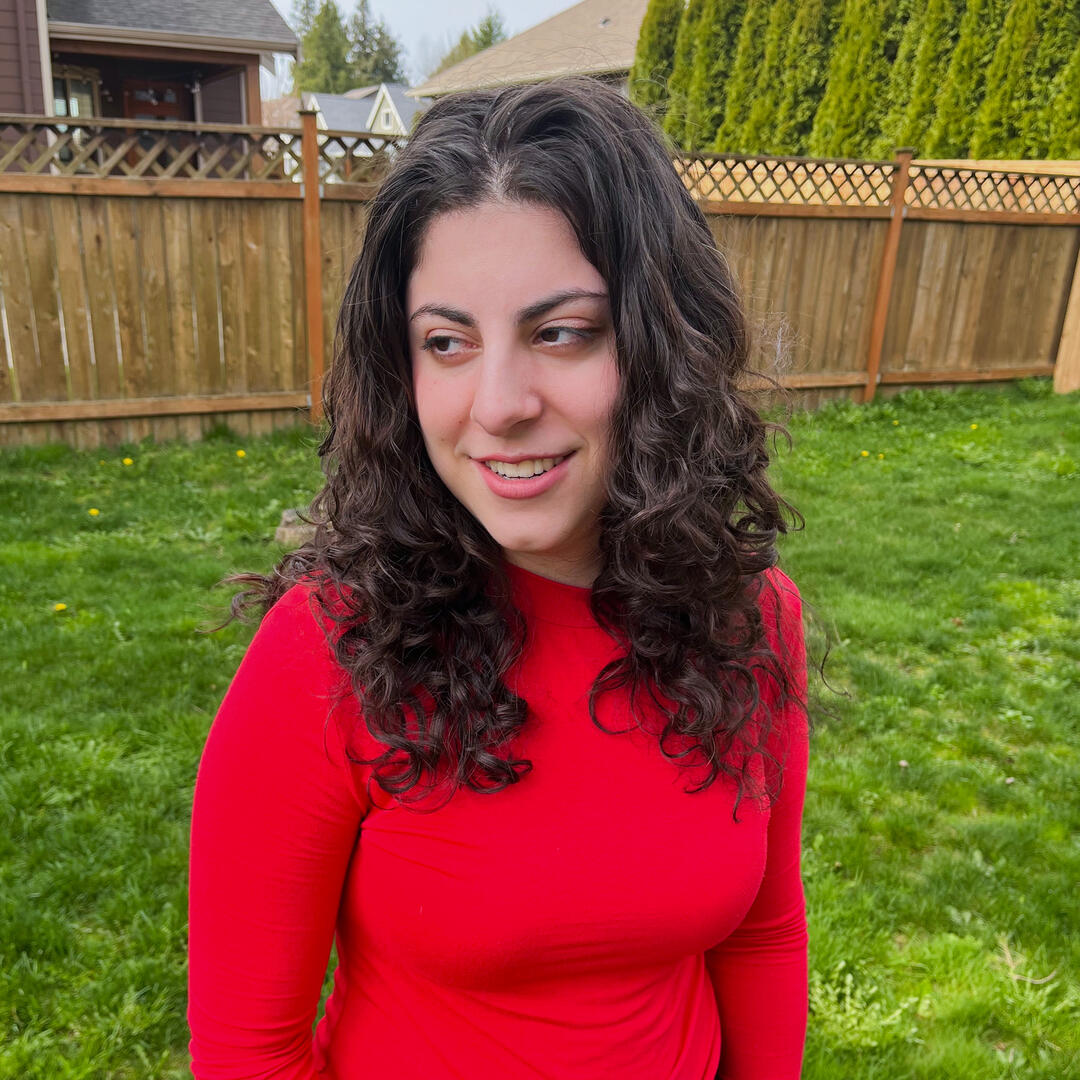
I’m Kayla, a digital media arts graduate from Bellevue College. My areas of specialty include graphic design, branding, logo work, motion design, and compositing. I also dabble in some poster design for film and music!I have experience in managing social media as well as understanding the fundamentals of marketing within multiple social media platforms. I consider myself a versatile artist, able to comply with different art styles and branding guidelines, and I hope to end up somewhere where I can grow my creative mind and utilize my graphic design skills at the same time.
The start of it all...
That drive to grow and create is what led me to form my personal brand, “Bartcn.” The unconventional brand name comes from my longtime online alias, which I started using in 2018 for my fan-editing work. I have been posting personal projects under this name for years, and I have made a huge connection with “Bartcn” as my creative identity. I’m excited to continue posting under this name, and now professionally too! “Bartcn” is a testament to the years of passion and hard work put behind the skillsets I have today.

Bartcn's submark logo
Poster Design
An assortment of self-initiated poster designs exploring movie, TV, and concert visuals. While most are conceptual, they represent my passion for promotional and entertainment design.
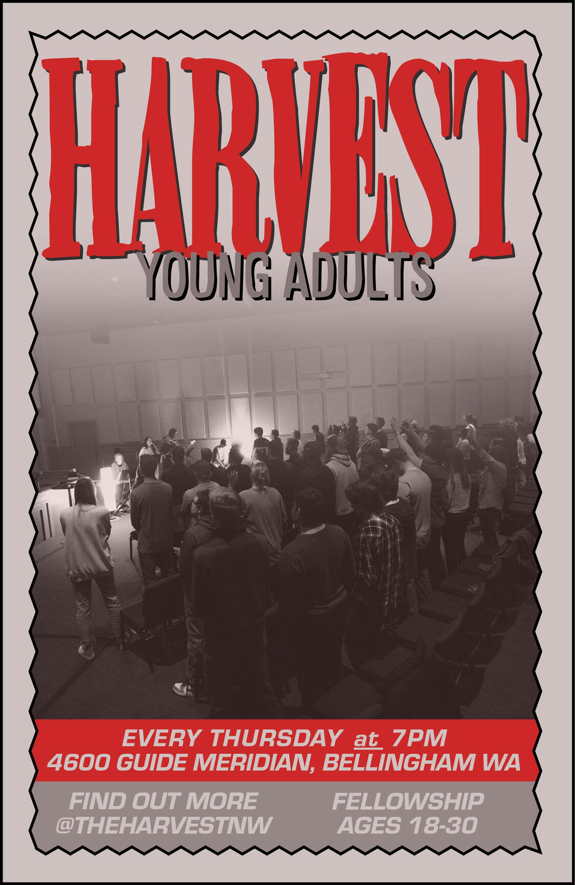
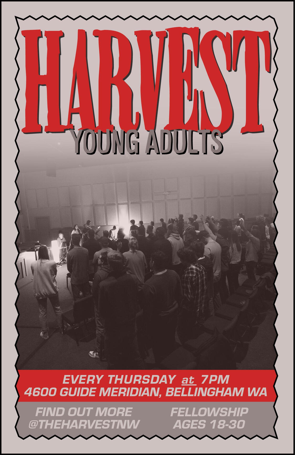
Promo Poster for The Harvest
We printed 100 of these posters and gave them to members to hang publicly around Whatcom County. Design inspired by indie concert posters of the 90s.
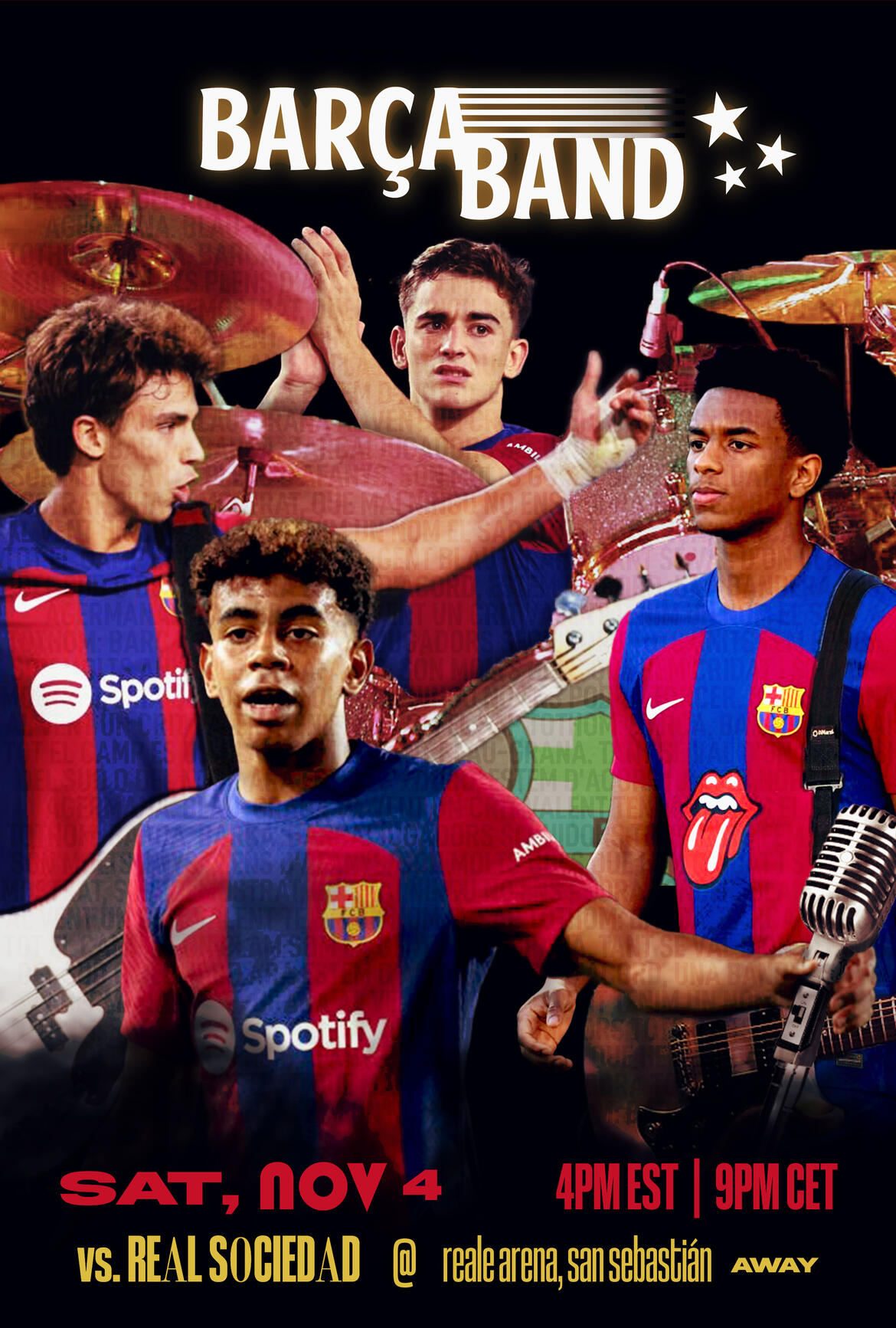
"Barça Band" — Spec Game-Day Poster
An unofficial game-day poster made for FC Barcelona in 2023. Design inspired by punk-rock band posters. This project has a huge focus on compositing and coloring to create the "Barça Band."
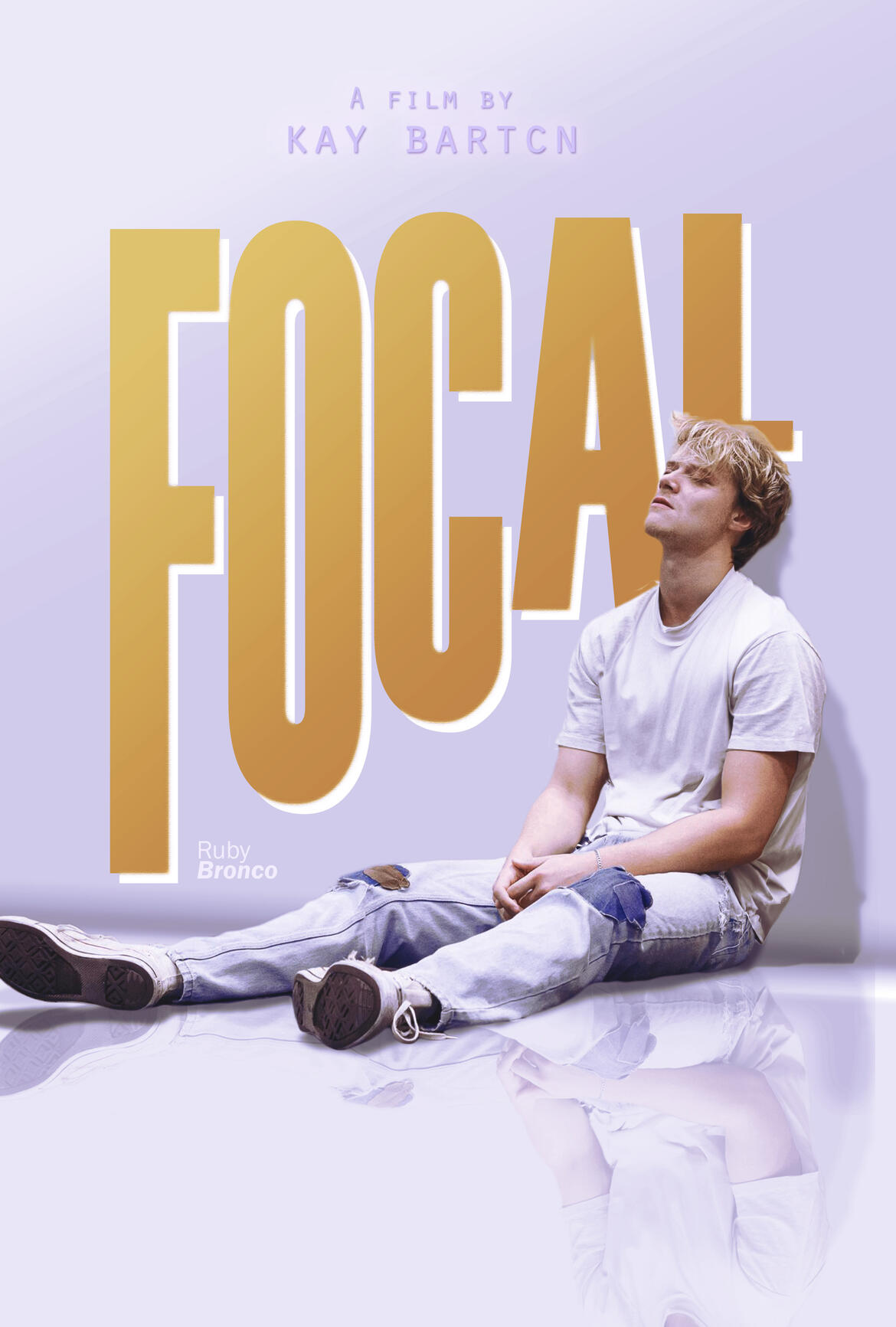
"FOCAL" — Spec Film Poster
A concept poster inspired by the understated aesthetic of modern independent cinema. This piece has a focus on global lighting across visual elements and a mirrored floor effect using my masked subject and added shadows to create depth.
"Jimmy!" — Concept Teen-Mag Style Poster
Created as part of a 3-page asset for a motion design project. Heavily inspired by idol posters included in teen magazines of the 90s-2000s.


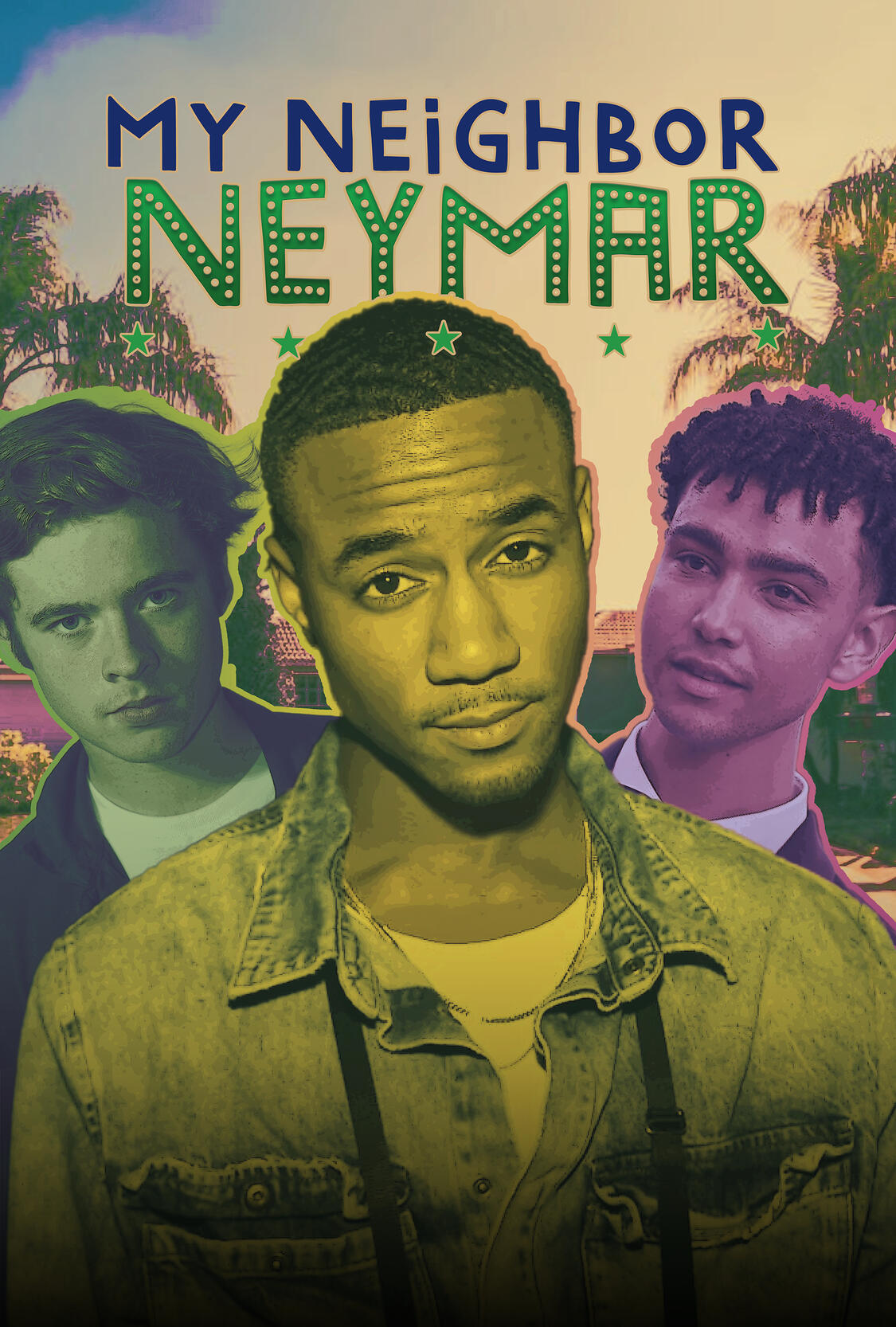
"My Neighbor Neymar" — Spec TV Show Poster
Concept poster for a fictional TV show about an alternate-universe Neymar settling in SoCal. Influenced by Apple TV+ visuals and Brazilian design, it explores the tone of a contemporary sports comedy.
Contact
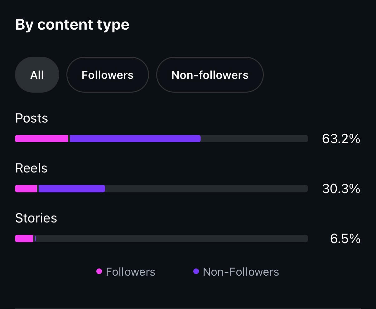
This screenshot shown is not completely accurate since it was taken months after The Harvest went on a hiatus, but it still goes to show that our reach was impactful from the time that the page was still active.
Reach Statistics
On the Harvest Instgram page (@theharvestnw), we would consistantly reach 200%+ percent of our follower count with the posts I created— most often with Reels. There was some usage of Instagram's marketing tools on select posts, but a lot of the reach was natural and came from planning on my end of what type of content needed to be produced to gain (and keep) viewership. This was accomplished not only with creative editing, but keeping in mind the psychology of marketing and keeping the attention of viewers: such as utilizing trends and hooks to draw viewers in.
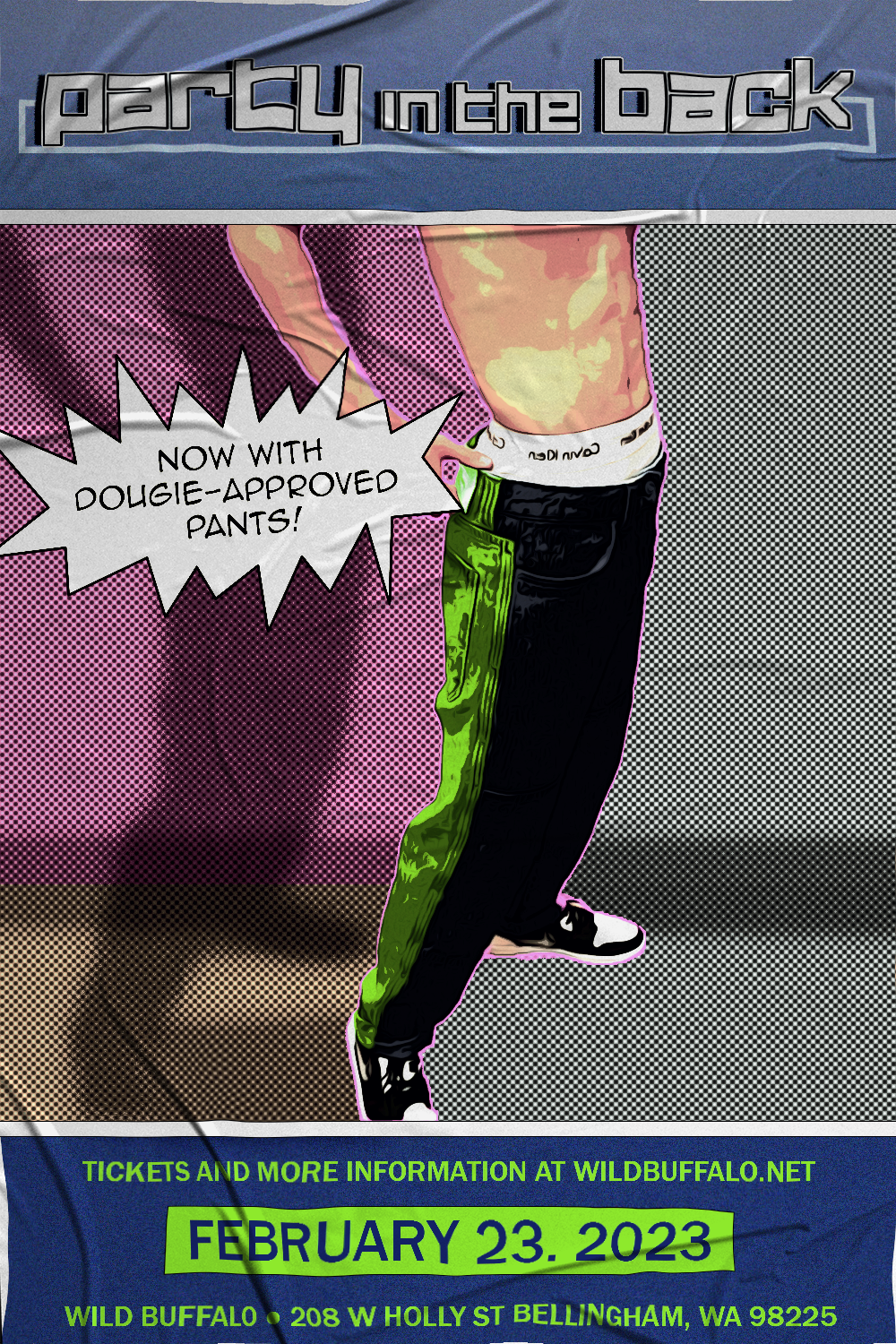
"Party in the Back" — Spec Concert Poster
A spec concert poster for a fictional pop-punk band. Inspired by simple, but fun indie grunge/punk-y poster art from the 90s to current day.